A
number of brochures, mailers, postcards, forms, adverts and other promotional
materials had to be produced for Engineering 2003 including these pieces. Postcards,
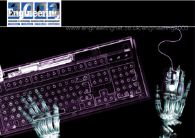
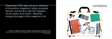
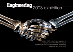
like the one on the right, were sent out to the magazine's large Subscription
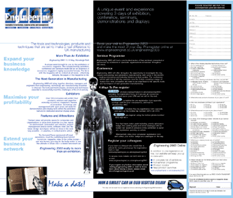
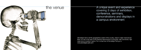
list, along with the A5 brochure on the left. Unlike the A4 brochures these
were aimed at visitors rather than exhibitors, so their job was to communicate
the essential information such as time and place. As a result these brochure
were more visual and less text so Mr Skeleton was introduced. This character
was introduced to introduce some humour into the exhibitions promotion.
ENGINEERING
2003
Visitor Brochure, mailers and postcard
I
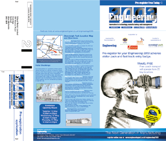
also produced a mailer, A4 when folded, which included a tear off section for
pre-registration and the website for the exhibition and conference. The website
followed the same design style as it's printed folders and letterheads with
the same blues and clear white space.
